Collaboration papers
I’ve been a member of the LIGO Scientific Collaboration for just over a year now. It turns out that designing, building and operating a network of gravitational-wave detectors is rather tricky, maybe even harder than completing Super Mario Bros. 3, so it takes a lot of work. There are over 900 collaboration members, all working on different aspects of the project. Since so much of the research is inter-related, certain papers (such as those that use data from the instruments) written by collaboration members have to include the name of everyone who works (at least half the time) on LIGO-related things. After a year in the collaboration, I have now levelled up to be included in the full author list (if there was an initiation ritual, I’ve suppressed the memory). This is weird: papers appear with my name on that I’ve not actually done any work for. It seems sort of like having to bring cake into your office on your birthday: you do have to share your (delicious) cupcakes with everyone else, but in return you get cake even when your birthday is nowhere near. Perhaps all those motivational posters where right about the value of teamwork? I do feel a little guilty about all the extra trees that will die because of people printing out these papers.
My New Year’s resolution was to write a post about every paper I have published. I am going to try to do the LIGO papers too. This should at least make sure that I actually read them all. There are official science summaries written by the people who did actually do the work, which may be better if you actually want an accurate explanation. My first collaboration paper is a joint publication of the LIGO and Virgo collaborations (even more sharing).
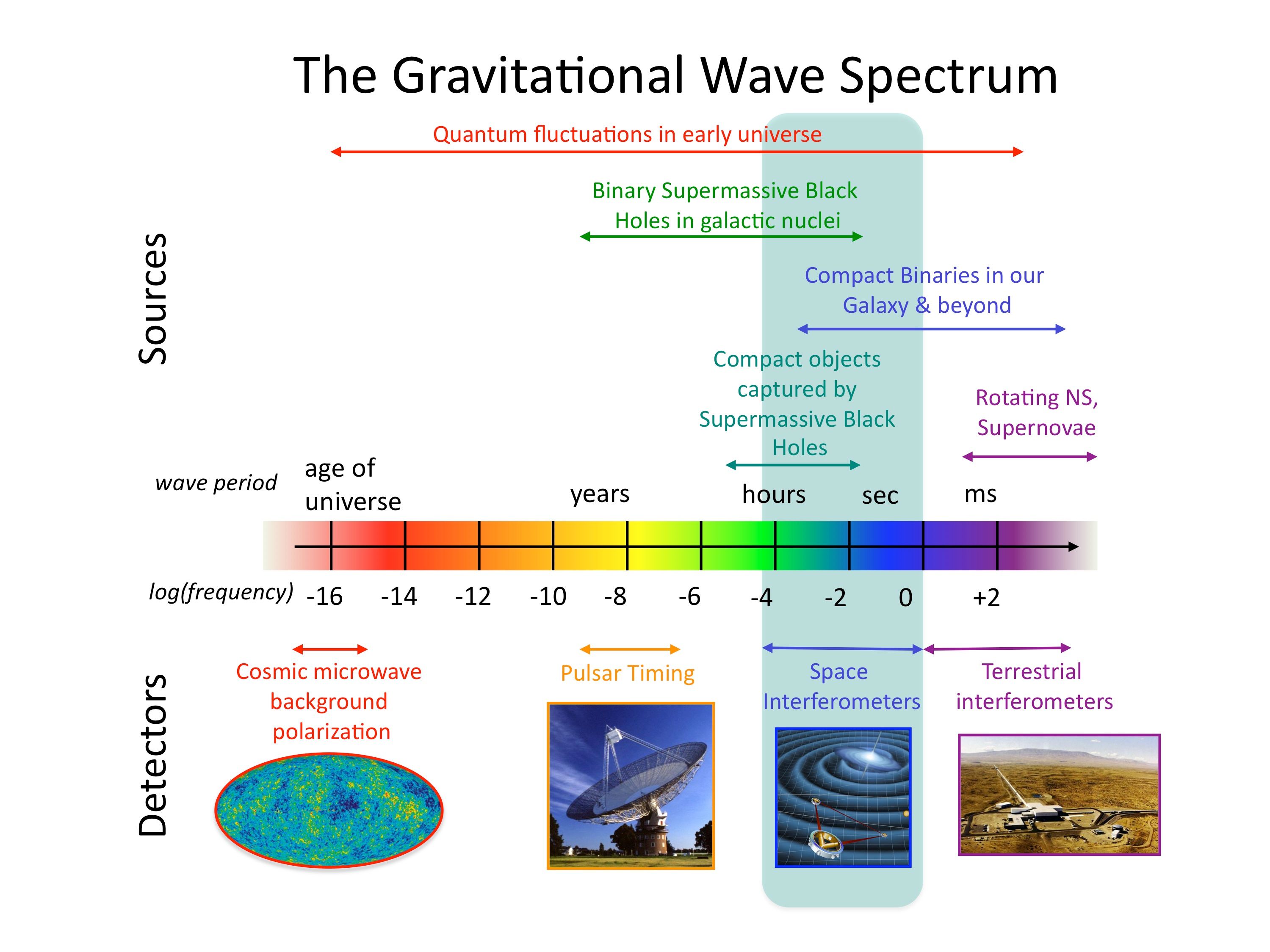
Searching for gravitational waves from pulsars
Neutron stars are formed from the cores of dead stars. When a star’s nuclear fuel starts to run out, their core collapses. The most massive form black holes, the lightest (like our Sun) form white dwarfs, and the ones in the middle form neutron stars. These are really dense, they have about the same mass as our entire Sun (perhaps twice the Sun’s mass), but are just a few kilometres across. Pulsars are a type of neutron star, they emit a beam of radiation that sweeps across the sky as they rotate, sort of like a light-house. If one of these beams hits the Earth, we see a radio pulse. The pulses come regularly, so you can work out how fast the pulsar is spinning (and do some other cool things too).

The mandatory cartoon of a pulsar that everyone uses. The top part shows the pulsar and its beams rotating, and the bottom part shows the signal measured on Earth. We not really sure where the beams come from, it’ll be something to do with magnetic fields. Credit: M. Kramer
Because pulsars rotate really quickly, if they have a little bump on their surface, they can emit (potentially detectable) gravitational waves. This paper searches for these signals from the Crab and Vela pulsars. We know where these pulsars are, and how quickly they are rotating, so it’s possible to do a targeted search for gravitational waves (only checking the data for signals that are close to what we expect). Importantly, some wiggle room in the frequency is allowed just in case different parts of the pulsar slosh around at slightly different rates and so the gravitational-wave frequency doesn’t perfectly match what we’d expect from the frequency of pulses; the search is done in a narrow band of frequencies around the expected one. The data used is from Virgo’s fourth science run (VSR4). That was taken back in 2011 (around the time that Captain America was released). The search technique is new (Astone et al., 2014), it’s the first one that incorporates this searching in a narrow band of frequencies; I think the point was to test their search technique on real data before the advanced detectors start producing new data.

Composite image of Hubble (red) optical observations and Chandra (blue) X-ray observations of the Crab pulsar. The pulsar has a mass of 1.4 solar masses and rotates every 30 ms. Credit: Hester et al.
The pulsars emit gravitational waves continuously, they just keep humming as they rotate. The frequency will slow gradually as the pulsar loses energy. As the Earth rotates, the humming gets louder and quieter because the sensitivity of gravitational-wave detectors depends upon where the source is in the sky. Putting this all together gives you a good template for what the signal should look like, and you can see how well it fits the data. It’s kind of like trying to find the right jigsaw piece by searching for the one that interlocks best with those around it. Of course, there is a lot of noise in our detectors, so it’s like if the jigsaw was actually made out of jelly: you could get many pieces to fit if you squeeze them the right way, but then people wouldn’t believe that you’ve actually found the right one. Some detection statistics (which I don’t particularly like, but probably give a sensible answer) are used to quantify how likely it is that they’ve found a piece that fits (that there is a signal). The whole pipeline is tested by analysing some injected signals (artificial signals made to see if things work made both by adding signals digitally to the data and by actually jiggling the mirrors of the interferometer). It seems to do OK here.
Turning to the actual data, they very carefully show that they don’t think they’ve detected anything for either Vela or Crab. Of course, all the cool kids don’t detect gravitational waves, so that’s not too surprising.

This paper doesn’t claim a detection of gravitational waves, but it doesn’t stink like Zoidberg.
Having not detected anything, you can place an upper limit of the amplitude of any waves that are emitted (because if they were larger, you would’ve detected them). This amplitude can then be compared with what’s expected from the spin-down limit: the amplitude that would be required to explain the slowing of the pulsar. We know how the pulsars are slowing, but not why; it could be because of energy being lost to magnetic fields (the energy for the beams has to come from somewhere), it could be through energy lost as gravitational waves, it could be because of some internal damping, it could all be gnomes. The spin-down limit assumes that it’s all because of gravitational waves, you couldn’t have bigger amplitude waves than this unless something else (that would have to be gnomes) was pumping energy into the pulsar to keep it spinning. The upper limit for the Vela pulsar is about the same as the spin-down limit, so we’ve not learnt anything new. For the Crab pulsar, the upper limit is about half the spin-down limit, which is something, but not really exciting. Hopefully, doing the same sort of searches with data from the advanced detectors will be more interesting.
In conclusion, the contents of this paper are well described by its title:
- Narrow-band search: It uses a new search technique that is not restricted to the frequency assumed from timing pulses
- of continuous gravitational-wave signals: It’s looking for signals from rotating neutron stars (that just keep going) and so are always in the data
- from Crab and Vela pulsars: It considers two particular sources, so we know where in parameter space to look for signals
- in Virgo VSR4 data: It uses real data, but from the first generation detectors, so it’s not surprising it doesn’t see anything
It’s probably less fun that eating a jigsaw-shaped jelly, but it might be more useful in the future.
arXiv: 1410.8310 [gr-qc]
Journal: Physical Review D; 91(2):022004(15); 2015
Science summary: An Extended Search for Gravitational Waves from the Crab and Vela Pulsars
Percentage of paper that is author list: ~30%


 that is really convenient if you’re a cosmologist, but a pain for anyone else. It does have the advantage of making the pulsar timing arrays look more sensitive though.
