An introduction to LIGO–Virgo data analysis

LIGO and Virgo make their data open for anyone to try analysing [bonus note]. If you’re a student looking for a project, a teacher planning a class activity, or a scientist working on a paper, this data is waiting for you to use. Understanding how to analyse the data can be tricky. In this post, I’ll share some of the resources made by LIGO and Virgo to help introduce gravitational-wave analysis. These papers together should give you a good grounding in how to get started working with gravitational-wave data.

If you’d like a more in-depth understanding, I’d recommend visiting your local library for Michele Maggiore’s  Gravitational Waves: Volume 1.

The Data Analysis Guide

Title: A guide to LIGO-Virgo detector noise and extraction of transient gravitational-wave signals
arXiv:
1908.11170 [gr-qc]
Journal: Classical & Quantum Gravity; 37(5):055002(54); 2020
Tutorial notebook: GitHub;  Google Colab; Binder
Code repository: Data Guide
LIGO science summary: A guide to LIGO-Virgo detector noise and extraction of transient gravitational-wave signals

It took many decades to develop the technology necessary to build gravitational-wave detectors. Similarly, gravitational-wave data analysis has developed over many decades—I’d say LIGO analysis was really kicked off in the early 1990s by Kipp Thorne’s group. There are now hundreds of papers on various aspects of gravitational-wave analysis. If you are new to the area, where should you start? Don’t panic! For the binary sources discovered so far, this Data Analysis Guide has you covered.

More details: The Data Analysis Guide

The GWOSC Paper

Title: Open data from the first and second observing runs of Advanced LIGO and Advanced Virgo
arXiv:
1912.11716 [gr-qc]
Journal: SoftwareX; 13:100658(20); 2021
Website: Gravitational Wave Open Science Center
LIGO science summary: Open data from the first and second observing runs of Advanced LIGO and Advanced Virgo

Data from the LIGO and Virgo detectors is released by the Gravitational Wave Open Science Center (GWOSC, pronounced, unfortunately, as it is spelt). If you want to try analysing our delicious data yourself, either searching for signals or studying the signals we have found, GWOSC is the place to start. This paper outlines how these data are produced, going from our laser interferometers to your hard-drive. The paper specifically looks at the data released for our first and second observing runs (O1 and O2), however, GWOSC also host data from the initial detectors’ fifth science run (S5) and sixth science run (S6), and will be updated with new data in the future.

If you do use data from GWOSC, please remember to say thank you.

More details: The GWOSC Paper

001100 010010 011110 100001 101101 110011

I thought I saw a 2! Credit: Fox

The Data Analysis Guide

Synopsis: Data Analysis Guide
Read this if: You want an introduction to signal analysis
Favourite part: This is a great resource for new students [bonus note]

Gravitational-wave detectors measure ripples in spacetime. They record a simple time series of the stretching and squeezing of space as a gravitational wave passes. Well, they measure that, plus a whole lot of noise. Most of the time it is just noise. How do we go from this time series to discoveries about the Universe’s black holes and neutron stars? This paper gives the outline, it covers (in order)

  1. An introduction to observations at the time of writing
  2. The basics of LIGO and Virgo data—what it is the we analyse
  3. The basics of detector noise—how we describe sources of noise in our data
  4. Fourier analysis—how we go from time series to looking at the data in the as a function of frequency, which is the most natural way to analyse that data.
  5. Time–frequency analysis and stationarity—how we check the stability of data from our detectors
  6. Detector calibration and data quality—how we make sure we have good quality data
  7. The noise model and likelihood—how we use our understanding of the noise, under the assumption of it being stationary, to work out the likelihood of different signals being in the data
  8. Signal detection—how we identify times in the data which have a transient signal present
  9. Inferring waveform and physical parameters—how we estimate the parameters of the source of a gravitational wave
  10. Residuals around GW150914—a consistency check that we have understood the noise surrounding our first detection

The paper works through things thoroughly, and I would encourage you to work though it if you are interested.

I won’t summarise everything here, I want to focus the (roughly undergraduate-level) foundations of how we do our analysis in the frequency domain. My discussion of the GWOSC Paper goes into more detail on the basics of LIGO and Virgo data, and some details on calibration and data quality. I’ll leave talking about residuals to this bonus note, as it involves a long tangent and me needing to lie down for a while.

Fourier analysis

The signal our detectors measure is a time series d(t). This is may just contain noise, d(t) = n(t), or it may also contain a signal, d(t) = n(t) + h(t).

There are many sources of noise for our detectors. The different sources can affect different frequencies. If we assume that the noise is stationary, so that it’s properties don’t change with time, we can simply describe the properties of the noise with the power spectral density S_n(f). On average we expect the noise at a given frequency to be zero, but with it fluctuating up and down with a variance given by the power spectral density. We typically approximate the noise as Gaussian, such that

n(f) \sim \mathcal{N}(0; S_n(f)/2),

where we use \mathcal{N}(\mu; \sigma^2) to represent a normal distribution with mean \mu and standard deviation \sigma. The approximations of stationary and Gaussian noise are good most of the time. The noise does vary over time, but is usually effectively stationary over the durations we look at for a signal. The noise is also mostly Gaussian except for glitches. These are taken into account when we search for signals, but we’ll ignore them for now. The statistical description of the noise in terms of the power spectral density allows us to understand our data, but this understanding comes as a function of frequency: we must transform of time domain data to frequency domain data.

The go from d(t) to d(f) we can use a Fourier transform. Fourier transforms are a way of converting a function of one variable into a function of a reciprocal variable—in the case of time you convert to frequency. Fourier transforms encode all the information of the original function, so it is possible to convert back and forth as you like. Really, a Fourier transform is just another way of looking at the same function.

The Fourier transform is defined as

d(f) = \mathcal{F}_f\left\{d(t)\right\} = \int_{-\infty}^{\infty} d(t) \exp(-2\pi i f t) \,\mathrm{d}t.

Now, from this you might notice a problem when it comes to real data analysis, namely that the integral is defined over an infinite amount of time. We don’t have that much data. Instead, we only have a short period.

We could recast the integral above over a shorter time if instead of taking the Fourier transform of d(t), we take the Fourier transform of d(t) \times w(t) where w(t) is some window function which goes to zero outside of the time interval we are looking at. What we end up with is a convolution of the function we want with the Fourier transform of the window function,

\mathcal{F}_f\left\{d(t)w(t)\right\} = d(f) \ast w(f).

It is important to pick a window function which minimises the distortion to the signal that we want. If we just take a tophat (also known as a boxcar or rectangular, possibly on account of its infamous criminal background) function which is abruptly cuts off the data at the ends of the time interval, we find that w(f) is a sinc function. This is not a good thing, as it leads to all sorts of unwanted correlations between different frequencies, commonly known as spectral leakage. A much better choice is a function which smoothly tapers to zero at the edges. Using a tapering window, we lose a little data at the edges (we need to be careful choosing the length of the data analysed), but we can avoid the significant nastiness of spectral leakage. A tapering window function should always be used. Then or finite-time Fourier transform is then a good approximation to the exact d(f).

Data treatment to highlight a signal

Data processing to reveal GW150914. The top panel shows raw Hanford data. The second panel shows a window function being applied. The third panel shows the data after being whitened. This cleans up the data, making it easier to pick out the signal from all the low frequency noise. The bottom panel shows the whitened data after a bandpass filter is applied to pick out the signal. We don’t use the bandpass filter in our analysis (it is just for illustration), but the other steps reflect how we treat our data. Figure 2 of the Data Analysis Guide.

Now we have our data in the frequency domain, it is simple enough to compare the data to the expected noise a t a given frequency. If we measure something loud at a frequency with lots of noise we should be less surprised than if we measure something loud at a frequency which is usually quiet. This is kind of like how somewhat shouting is less startling at a rock concert than in a library. The appropriate way to weight is to divide by the square root of power spectral density d_\mathrm{w}(f) \propto d(f)/[S_n(f)]^{1/2}. This is known as whitening. Whitened data should have equal amplitude fluctuations at all frequencies, allowing for easy comparisons.

Now we understand the statistical properties of noise we can do some analysis! We can start by testing our assumption that the data are stationary and Gaussian by checking that that after whitening we get the expected distribution. We can also define the likelihood of obtaining the data d(t) given a model of a gravitational-wave signal h(t), as the properties of the noise mean that d(f) - h(f) \sim \mathcal{N}(0; S_n(f)/2). Combining the likelihood for each individual frequency gives the overall likelihood

\displaystyle p(d|h) \propto \exp\left[-\int_{-\infty}^{\infty} \frac{|d(f) - h(f)|^2}{S_n(f)} \mathrm{d}f \right].

This likelihood is at the heart of parameter estimation, as we can work out the probability of there being a signal with a given set of parameters. The Data Analysis Guide goes through many different analyses (including parameter estimation) and demonstrates how to check that noise is nice and Gaussian.

Gaussian residuals for GW150914

Distribution of residuals for 4 seconds of data around GW150914 after subtracting the maximum likelihood waveform. The residuals are the whitened Fourier amplitudes, and they should be consistent with a unit Gaussian. The residuals follow the expected distribution and show no sign of non-Gaussianity. Figure 14 of the Data Analysis Guide.

Homework

The Data Analysis Guide contains much more material on gravitational-wave data analysis. If you wanted to delve further, there many excellent papers cited. Favourites of mine include Finn (1992); Finn & Chernoff (1993); Cutler & Flanagan (1994); Flanagan & Hughes (1998); Allen (2005), and Allen et al. (2012). I would also recommend the tutorials available from GWOSC and the lectures from the Open Data Workshops.

The GWOSC Paper

Synopsis: GWOSC Paper
Read this if: You want to analyse our gravitational wave data
Favourite part: All the cool projects done with this data

You’re now up-to-speed with some ideas of how to analyse gravitational-wave data, you’ve made yourself a fresh cup of really hot tea, you’re ready to get to work! All you need are the data—this paper explains where this comes from.

Data production

The first step in getting gravitational-wave data is the easy one. You need to design a detector, convince science agencies to invest something like half a billion dollars in building one, then spend 40 years carefully researching the necessary technology and putting it all together as part of an international collaboration of hundreds of scientists, engineers and technicians, before painstakingly commissioning the instrument and operating it. For your convenience, we have done this step for you, but do feel free to try it yourself at home.

Gravitational-wave detectors like Advanced LIGO are built around an interferometer: they have two arms at right angles to each other, and we bounce lasers up and down them to measure their length. A passing gravitational wave will change the relative length of one arm relative to the other. This changes the time taken to travel along one arm compared to the other. Hence, when the two bits of light reach the output of the interferometer, they’ll have a different phase:where normally one light wave would have a peak, it’ll have a trough. This change in phase will change how light from the two arms combine together. When no gravitational wave is present, the light interferes destructively, almost cancelling out so that the output is dark. We measure the brightness of light at the output which tells us about how the length of the arms changes.

We want our detector in measure the gravitational-wave strain. That is the fractional change in length of the arms,

\displaystyle h(t) = \frac{\Delta L(t)}{L},

where \Delta L = L_x - L_y is the relative difference in the length of the two arms, and L is the usually arm length. Since we love jargon in LIGO & Virgo, we’ll often refer to the strain as HOFT (as you would read h(t) as h of t; it took me years to realise this) or DARM (differential arm measurement).

The actual output of the detector is the voltage from a photodiode measuring the intensity of the light. It is necessary to make careful calibration of the detectors. In theory this is simple: we change the position of the mirrors at the end of the arms and see how the output changes. In practise, it is very difficult. The GW150914 Calibration Paper goes into details for O1, more up-to-date descriptions are given in Cahillane et al. (2017) for LIGO and Acernese et al. (2018) for Virgo. The calibration of the detectors can drift over time, improving the calibration is one of the things we do between originally taking the data and releasing the final data.

The data are only celebrated between 10 Hz and 5 kHz, so don’t trust the data outside of that frequency range.

The next stage of our data’s journey is going through detector characterisation and data quality checks. In addition to measuring gravitational-wave strain, we record many other data channels: about 200,000 per detector. These measure all sorts of things, from the internal state of the instrument, to monitoring the physical environment around the detectors. These auxiliary channels are used to check the data quality. In some cases, an auxiliary channel will record a source of noise, like scattered light or the mains power frequency, allowing us to clean up our strain data by subtracting out this noise. In other cases, an auxiliary channel can act as a witness to a glitch in our detector, identifying when it is misbehaving so that we know not to trust that part of the data. The GW150914 Detector Characterisation Paper goes into details of how we check potential detections. In doing data quality checks we are careful to only use the auxiliary channels which record something which would be independent of a passing gravitational wave.

We have 4 flags for data quality:

  1. DATA: All clear. Certified fresh. Eat as much as you like.
  2. CAT1: A critical problem with the instrument. Data from these times are likely to be a dumpster fire of noise. We do not use them in our analyses, and they are currently excluded from our public releases. About 1.7% of Hanford data and 1.0% of time from Livingston was flagged with CAT1 in O1. In O2,  we got this done to 0.001% for Hanford, 0.003% for Livingston and 0.05% for Virgo.
  3. CAT2: Some activity in an auxiliary channel (possibly the electric boogaloo monitor) which has a well understood correlation with the measured strain channel. You would therefore expect to find some form of glitchiness in the data.
  4. CAT3: There is some correlation in an auxiliary channel and the strain channel which is not understood. We’re not currently using this flag, but it’s kept as an option.

It’s important to verify the data quality before starting your analysis. You don’t want to get excited to discover a completely new form of gravitational wave only to realise that it’s actually some noise from nearby logging. Remember, if a tree falls in the forest and no-one is around, LIGO will still know.

To test our systems, we also occasionally perform a signal injection: we move the mirrors to simulate a signal. This is useful for calibration and for testing analysis algorithms. We don’t perform injections very often (they get in the way of looking for real signals), but these times are flagged. Just as for data quality flags, it is important to check for injections before analysing a stretch of data.

Once passing through all these checks, the data is ready to analyse!

Yes!

Excited Data. Credit: Paramount

Accessing the data

After our data have been lovingly prepared, they are served up in two data formats:

  • Hierarchical Data Format HDF, which is a popular data storage format, as it is easily allows for metadata and multiple data sets (like the important data quality flags) to be packaged together.
  • Gravitational Wave Frame GWF, which is the standard format we use internally. Veteran gravitational-wave scientists often get a far-way haunted look when you bring up how the specifications for this file format were decided. It’s best not to mention unless you are also buying them a stiff drink.

In these files, you will find h(t) sampled at either 4096 Hz or 16384 Hz (either are available). Pick the sampling rate you need depending upon the frequency range you are interested in: the 4096 Hz data are good for upto 1.7 kHz, while the 16384 Hz are good to the limit of the calibration range at 5 kHz.

Files can be downloaded from the GWOSC website. If you want to download a large amount, it is recommended to use the CernVM-FS distributed file system.

To check when the gravitational-wave detectors were observing, you can use the Timeline search.

GWOSC Timeline

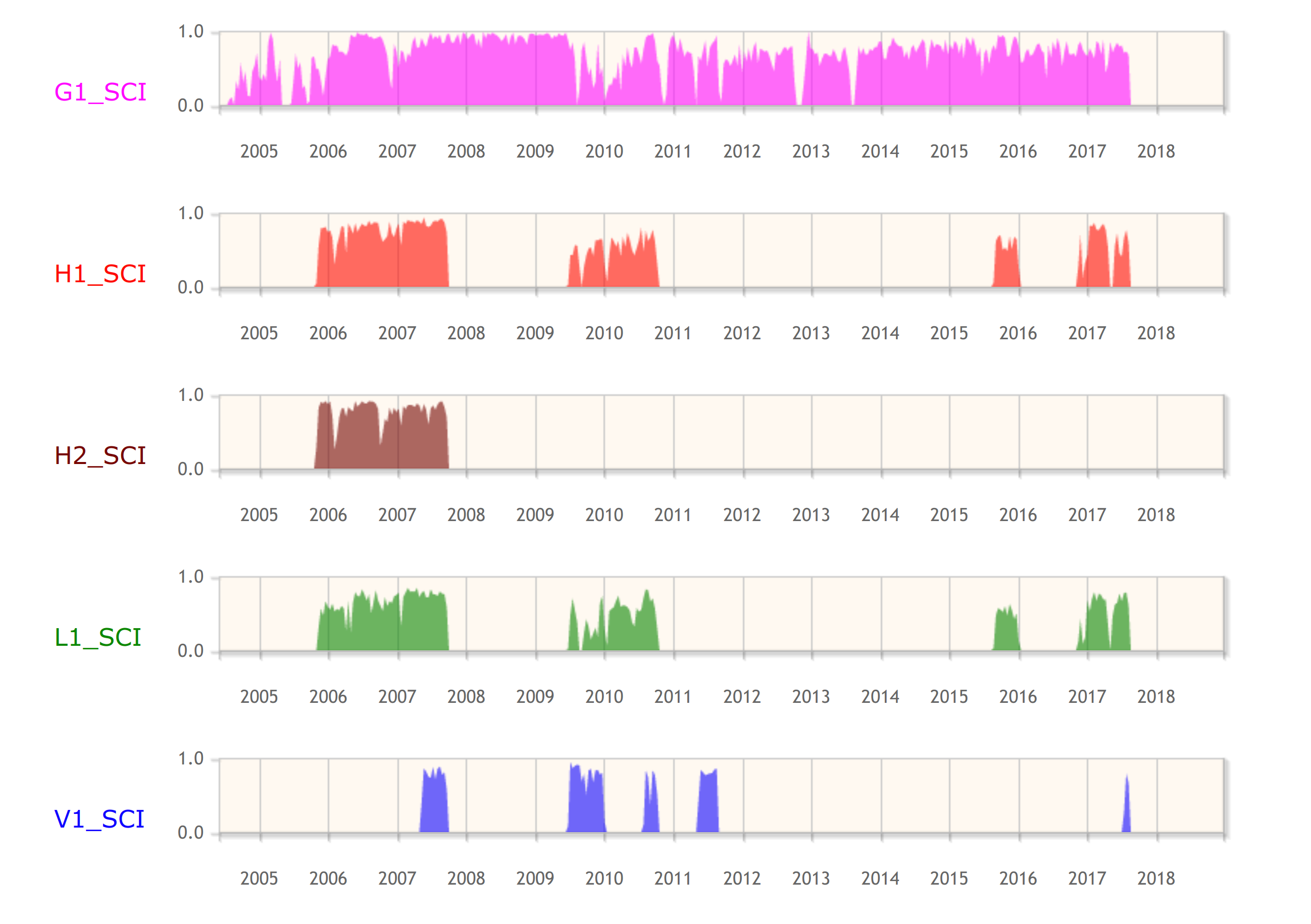
Screenshot of the GWOSC Timeline showing observing from the fifth science run (S5) on the initial detector era through to the second observing run (O2) of the advanced detector era. Bars show observing of GEO 600 (G1), Hanford (H1 and H2), Livingston (L1) and Virgo (V1). Hanford initial had two detectors housed within its site, the plan in the advanced detector era is to install the equipment as LIGO India instead.

Try this at home

Having gone through all these details, you should now know what are data is, over what ranges it can be analyzed, and how to get access to it. Your cup of tea has also probably gone cold. Why not make yourself a new one, and have a couple of biscuits as reward too. You deserve it!

To help you on your way in starting analysing the data, GWOSC has a set of tutorials (and don’t forget the Data Analysis Guide), and a collection of open source software. Have fun, and remember, it’s never aliens.

Bonus notes

Release schedule

The current policy is that data are released:

  1. In a chunk surrounding an event at time of publication of that event. This enables the new detection to be analysed by anyone. We typically release about an hour of data around an event.
  2. 18 months after the end of the run. This time gives us chance to properly calibrate the data, check the data quality, and then run the analyses we are committed to. A lot of work goes into producing gravitational wave data!

Start marking your calendars now for the release of O3 data.

Summer studenting

In summer 2019, while we were finishing up on the Data Analysis Guide, I gave it to one of my summer students Andrew Kim as an introduction. Andrew was working on gravitational-wave data analysis, so I hoped that he’d find it useful. He ended up working through the draft notebook made to accompany the paper and making a number of useful suggestions! He ended up as an author on the paper because of these contributions, which was nice.

The conspiracy of residuals

The Data Analysis Guide is an extremely useful paper. It explains many details of gravitational-wave analysis. The detections made by LIGO and Virgo over the last few years has increased the interest in analysing gravitational waves, making it the perfect time to write such an article. However, that’s not really what motivated us to write it.

In 2017, a paper appeared on the arXiv making claims of suspicious correlations in our LIGO data around GW150914. Could this call into question the very nature of our detection? No. The paper has two serious flaws.

  1. The first argument in the paper was that there were suspicious phase correlations in the data. This is because the authors didn’t window their data before Fourier transforming.
  2. The second argument was the residuals presented in Figure 1 of the GW150914 Discovery Paper contain a correlation. This is true, but these residuals aren’t actually the results of how we analyse the data. The point of Figure 1 was to that you don’t need our fancy analysis to see the signal—you can spot it by eye. Unfortunately, doing things by eye isn’t perfect, and this imperfection was picked up on.

The first flaw is a rookie mistake—pretty much everyone does it at some point. I did it starting out as a first-year PhD student, and I’ve run into it with all the undergraduates I’ve worked with writing their own analyses. The authors of this paper are rookies in gravitational-wave analysis, so they shouldn’t be judged too harshly for falling into this trap, and it is something so simple I can’t blame the referee of the paper for not thinking to ask. Any physics undergraduate who has met Fourier transforms (the second year of my degree) should grasp the mistake—it’s not something esoteric you need to be an expert in quantum gravity to understand.

The second flaw is something which could have been easily avoided if we had been more careful in the GW150914 Discovery Paper. We could have easily aligned the waveforms properly, or more clearly explained that the treatment used for Figure 1 is not what we actually do. However, we did write many other papers explaining what we did do, so we were hardly being secretive. While Figure 1 was not perfect, it was not wrong—it might not be what you might hope for, but it is described correctly in the text, and none of the LIGO–Virgo results depend on the figure in any way.

Estimated waveforms from different models

Recovered gravitational waveforms from our analysis of GW150914. The grey line shows the data whitened by the noise spectrum. The dark band shows our estimate for the waveform without assuming a particular source. The light bands show results if we assume it is a binary black hole (BBH) as predicted by general relativity. This plot more accurately represents how we analyse gravitational-wave data. Figure 6 of the GW150914 Parameter Estimation Paper.

Both mistakes are easy to fix. They are at the level of “Oops, that’s embarrassing! Give me 10 minutes. OK, that looks better”. Unfortunately, that didn’t happen.

The paper regrettably got picked up by science blogs, and caused much of a flutter. There were demands that LIGO and Virgo publically explain ourselves. This was difficult—the Collaboration is set up to do careful science, not handle a PR disaster. One of the problems was that we didn’t want to be seen to policing the use of our data. We can’t check that every paper ever using our data does everything perfectly. We don’t have time, and that probably wouldn’t encourage people to use our data if they knew any mistake would be pulled up by this 1000 person collaboration. A second problem was that getting anything approved as an official Collaboration document takes ages—getting consensus amongst so many people isn’t always easy. What would you do—would you want to be the faceless Collaboration persecuting the helpless, plucky scientists trying to check results?

There were private communications between people in the Collaboration and the authors. It took us a while to isolate the sources of the problems. In the meantime, pressure was mounting for an official™ response. It’s hard to justify why your analysis is correct by gesturing to a stack of a dozen papers—people don’t have time to dig through all that (I actually sent links to 16 papers to a science journalist who contacted me back in July 2017). Our silence may have been perceived as arrogance or guilt.

It was decided that we would put out an unofficial response. Ian Harry had been communicating with the authors, and wrote up his notes which Sean Carroll kindly shared on his blog. Unfortunately, this didn’t really make anyone too happy. The authors of the paper weren’t happy that something was shared via such an informal medium; the post is too technical for the general public to appreciate, and there was a minor typo in the accompanying code which (since fixed) was seized upon. It became necessary to write a formal paper.

Oh, won't somebody please think of the children?

Peer review will save the children! Credit: Fox

We did continue to try to explain the errors to the authors. I have colleagues who spent many hours in a room in Copenhagen trying to explain the mistakes. However, little progress was made, and it was not a fun time™. I can imagine at this point that the authors of the paper were sufficiently angry not to want to listen, which is a shame.

Now that the Data Analysis Guide is published, everyone will be satisfied, right? A refereed journal article should quash all fears, surely? Sadly, I doubt this will be the case. I expect these doubts will keep circulating for years. After all, there are those who still think vaccines cause autism. Fortunately, not believing in gravitational waves won’t kill any children. If anyone asks though, you can tell them that any doubts on LIGO’s analysis have been quashed, and that vaccines cause adults!

For a good account of the back and forth, Natalie Wolchover wrote a nice article in Quanta, and for a more acerbic view, try Mark Hannam’s blog.

Advertisement

Equation etiquette

Mathematics can be beautiful. Equations are an important component of technical writing, but getting their presentation correct can be tricky. There are many rules about their formatting, and these can seem somewhat arbitrary. Just like starting with the outermost knife and fork at a fancy dinner, or passing the port to the left, these can seem rather ridiculous when you first learn them, but there is some logic to them. Here, I give a short guide to the proper etiquette of including equations in your writing.

0 Make introductions

The simplest rule: explain what your symbols mean. The dinner-party equivalent would be to introduce your guests, so that everyone knows whom they have to attempt conversation with. For an equation to be of any use, people need to know what it means. This can be especially important as some symbols are commonly used for different quantities. Introduce your readers to your symbols promptly, so that the equation makes sense. For example,

“Ohm’s law says that the voltage across a resistor is

V = IR,

where I is the current flowing through the resistor and R is the resistance of the resistor.”

Here, I left the definition of V implicit, but hopefully everyone’s now acquainted, so we can chat (probably about electronics) until the soup is ready.

Depending on your audience, there are some things you can get away without introducing. The mathematical constant \pi is always referred to as pi, so you can usually skip the definition of it being the ratio of a circle’s circumference to its diameter. \pi is the superstar guest that needs no introduction. If you are using the symbol for something else, make sure to make that clear!

Pi pie!

Pi pie! Perfect for any mathematical dinner party. Technically, there’s 2\pi of pie here. Credit: Tasty Retreat

While not as famous as \pi, the mathematical constants e, the base of the natural logarithm, and i = \sqrt{-1}, the imaginary unit, can sometimes be left undefined. They are dinner-party regulars, so as long as your guests have been invited along a few times before, they should have met. Unlike \pi, e and i are frequently used for other quantities, so if there’s chance of there being some confusion, play it safe and make the introduction (remember, no-one like having to ask the names of people that they’ve met before).

Finally, some of the fundamental physical constants like the speed of light c, the Newtonian constant G, Boltzmann’s constant k and the reduced Planck constant \hbar, can sometimes be left unintroduced if writing for professional physicists. They are guests that went to university together, so you can assume they know each other. If there is any chance of confusion though, make sure to introduce them. Try to never use a symbol for any of the constants that is not their usual one, that’s like giving a guest a new nickname for the purpose of the party. It will lead to all sorts of confusion, which might be amusing in a sit-com, but less so in scientific writing

Never use the same symbol for two different quantities. Just like having a seating plan with two identical names, this leads to confusion, arguments over who gets to sit next to the awesome physicist, and people being stabbed with forks. Using subscripts or superscripts, or a different font are common ways of avoiding a clash.

1 Punctuate properly

Equations should form a central component of your text. They are part of your sentences. Accordingly, they should be punctuated properly so that they make sense. This is like chewing with your mouth closed: no-one likes to see a mess.

It can be hard to put equations into words, to figure out where to put punctuation. However, they can usually be read as “left-hand side equals right-hand side”. Here, “equals” is a verb. Often an equation will need to be followed by comma, as above. Missing out punctuation is especially obvious when the equation comes at the end of a sentence and there’s no full stop.

Starting a sentence with an equation is a little weird, like serving the sweet before the soup, but I don’t think there’s anything to stop you. Consider the following examples.

“The most famous equation in physics is E = mc^2. This explains the equivalence of energy E and mass m, converting using the speed of light c.”

E =mc^2 is the most famous equation in physics. Here, E is the energy equivalent of mass m, and c is the speed of light in a vacuum.”

2 Fonts, roman, italic

Lend me you ears, I come with some of the finer details, like which fork to use. Variables are typeset in italics. This makes it easy to spot with letters are mathematical quantities and which are just plain text: a is a variable and a is just a short word.

Not everything that appears in an equation should be italicised. Numbers; operators like +, - and \times, and brackets (\ldots) are left as they are. These are always just themselves, so there’s no need to italicise, they are left roman (upright).

Function names, when more than one letter, are not italicised. For example \sin, \log or \min. This lets you know that these letters can’t be broken up, they come as a single unit. For example

\displaystyle \frac{sinx}{cosx} = \frac{in}{co},

but

\displaystyle \frac{\sin x}{\cos x} = \tan x.

Related to this, is the question of whether you should italicised the differential \mathrm{d}? I like to have it roman so it’s

\displaystyle \frac{\mathrm{d}x}{\mathrm{d}y} \quad and \quad \int f(x)\, \mathrm{d} x.

I think this makes it clear that the infinitesimal element \mathrm{d}x can’t be broken up (you can’t cancel \mathrm{d}). However, this is not universal, so I think this is much like whether you should prod or crush the peas onto your fork.

Subscripts and superscripts often lead to confusion. If they are part of a variable’s name, should they always be italicised? The answer is no: they should be treated as if they were in the main text. If I want to specify the area of a circle, it would be A_\mathrm{circle}, as circle is just a regular word. If I want to specify the coordinates of point \mathrm{P}, they are (x_\mathrm{P},\,y_\mathrm{P}), as \mathrm{P} is the name of the point, not a variable. If I wanted to talk about heat capacity, then the heat capacity at constant volume is C_V and the heat capacity at constant magnetic flux density is C_B because I’m using V and B to specify the volume and magnetic field respectively.

All this seems to make sense to me. It might seem strange that there’s a specific item of cutlery for each course, but it is easier to cut a steak with a steak knife than a butter knife, so there may be some logic to it. Similarly, the typesetting of maths does convey some meaning.

Sadly, there is a common exception to the rule, upper-case Greek letters are often not italicised, but are left upright, e.g. \Theta. (Lower-case Greek letters are italicised, as are our Latin upper-case letters). It could be that this gives a way of distinguishing between an upper-case beta \mathrm{B} and a capital B, chi \mathrm{X} and X, etc. However,  I think this is just because they look odd in some fonts. Italicising them wouldn’t be wrong. (Although, the summation symbol \sum and product symbol \prod are operators, and so should never be italicised).

3 Laying out units

Forgetting to include units is much like forgetting your trousers at a dinner party. It’s a definite faux pas, not to mention painful if you drop some of that hot soup. However, unlike the wearing of trousers, there is an international guideline on how to correctly use units. Units appear after a number separated by a small non-breaking space, e.g. x = 2.3~\mathrm{m}. The space needs to be non-breaking so that it’s never separated from the number, which would be painful.

Groundskeeper Willie

Trousers are not standardised, but units are! The Springfield Police are shocked when Willie forgets his. Credit: Fox

You may have noticed that units are not italicised. This makes them readily identifiable, and also avoids any confusion that a millimetre is the same as a square metre or that one hertz per henry could be z. Not italicising units means there’s a clear difference between T = 5~\mathrm{s} and T = 5s. The first indicates a time of five seconds, the second that T is five times s, whatever that might be. We can also write things like s = 5~\mathrm{s} without them being nonsense.

When making compound units, use negative powers rather than a slash so there are no ambiguities. It’s difficult to figure out \mathrm{m/s^2/kg^3}, but \mathrm{m~s^{-2}~kg^{-3}} is clear. You don’t want everyone pondering if you’ve accidentally put your trousers on back-to-front.

Finally, when plotting graphs, units should be included in the axis labels. I like to think of graphs just being of pure, dimensionless numbers, hence I need to divide out the units, e.g. T/~\mathrm{s} for time in seconds or C_V/(\mathrm{J~K^{-1}}) for heat capacity.

4 Use the right symbol for the job

Trying to eat your soup with your crab fork is not going to end well. You should always use the right tool for the job. When writing maths, this means using the correct symbol. The multiplication sign \times is not an x, and the minus sign - is not a hyphen.

5 Close your brackets

No parsing scripts should be harming in the reading of this

Pure evil. Credit: xkcd

To close, some tips on brackets. Brackets should always come in an (equally-size) pair. They should be large enough to enclose their contents. When eating, you should cut your food up into bite-size pieces, you can’t chop up equations in the same way, so instead you resize the brackets.

When nested brackets, use different types of brackets so it’s clear which term ends where. It’s usual to start with parentheses (\ldots), then use square brackets [\ldots], and then braces \{\ldots\}. Unlike with cutlery, you start inside and work your ways out. For example, making something up,

\displaystyle \exp\left\{-(1 + 2\xi)\left[(\xi - 1)^2 + \cos \left(\frac{\pi \xi}{2}\right)\right]^{-1/2}\right\}.

If you need more than three levels, you usually cycle round again.

There are a few cases where a particular type of bracket is used. Angle brackets \langle\ldots\rangle are often used for an average. Square brackets are often used to enclose the argument of a functional. Curly braces are often used for limits, \lim_{x\,\rightarrow\,0} \{\mathrm{sinc}\,x\} = 1, or Fourier transforms, \mathscr{F}_k\{f(x)\} = \tilde{f}(k). The important thing is to be clear, to make it easy for the reader to distinguish which brackets matches to which other.

That brings us to the end. We’ve closed all our brackets, and put our knife and fork together on our plate. Presenting equations clearly, like writing clearly, makes writing easy to understand. Paying attention to the details, making sure that you dot all your is and cross all your \hbars, creates a good impression, it shows you’re careful and that you care about your work. You may even get invited out to dinner again.

Tips for scientific writing

Second year physics undergraduates at the University of Birmingham have to write an essay as part of their course. As a tutor, it’s my job to give them advice on how to write in a scientific style (and then mark the results). I have assembled these tips to try to aid them (and make my marking less painful). Much of this advice also translates to paper writing, and I try to follow these tips myself.

Writing well is difficult. It requires practice. It is an important skill, yet it is something that I do not believe is frequently formally taught (at least in the sciences). Scientific and other technical writing can be especially hard, as it has its own rules that can be at odds with what we learn at school (when studying literature or creative writing). Reading the work of others is a good way for figuring out what works well and what does not.

In this post, I include some tips that I hope are useful (not everyone will agree). I begin by considering how to plan and structure a piece of writing (section 1), from the largest scale (section 1.2) progressing down to the smallest (section 1.4); then I discuss various aspects of technical writing (section 2), both in terms of content and style, including referencing (section 2.5), which is often problematic, and I conclude with some general editing advice (section 3) before summarising (section 4). If you have anything extra to add, please do so in the comments.

1 Structure and planning

The structure of your writing is important as it reflects the logical flow of your arguments. It is worth spending some time before you start writing considering what you want to say, and what is the best order for your ideas. (This is also true in exams: I have found when trying to answer essay questions it is worth the time to spend a couple of minutes planning, otherwise I am liable to miss out an important point). I frequently get frustrated that I must write linearly, one idea after another, and cannot introduce multiple strands at a time, with arguments intertwining with each other. However, putting in the effort to construct a clear progression does help your reader.

1.1 Title and audience

The first thing to consider is what you want to write and who is going to read it. Always write for your audience, and remember that professional scientists and the general public look for different things (this blog may be a poor example of this, as different posts are targeted towards different audiences).

Having thought about what you want to say, pick a title that reflects this. Don’t have a title “The life and works of Albert Einstein” if you are only going to cover special relativity, and don’t have a title “Equilibrium thermodynamics of non-oxide perovskite superconductors” if you are writing for a general audience. If your title is a question, make sure you answer it. It might be a good idea to write your title after you have finished your main text so that you can match it to what you have actually written.

1.2 Beginning, middle and end

To help your audience understand what you are telling them, begin with an introduction, and end with a summary. This is also true when giving a talk. Start by explaining what you will tell them, then tell them, then tell them what you told them. Repetition of key ideas makes them more memorable and help to emphasise what your audience should take away.

At the beginning, introduce the key ideas you will talk about. If you are writing an essay titled “The Solar Neutrino Problem“, you should explain what a solar neutrino is and why there is a problem. You might also like to explain why the reader should care. Sketching out the contents of the rest of the work is useful as it prepares the reader for what will follow: it’s like warm-up stretches for the mind. The introduction sets the scene for the arguments to follow.

The main body of your text contains most of the information, this is where you introduce your ideas and explain them. It is the burger between the buns of the introduction and conclusion. For longer documents, or subjects with many aspects, you might consider breaking this up into sections (and subsections). Using headings (perhaps numbered for reference) is good: skimming section headings should give an outline of the contents. Some sections within the main body might be sufficiently involved to merit their own introduction and summary. There should be a clear progression of ideas: if you find there is a big jump, try writing some text to cover the transition (“Having explained how neutrinos are produced in the Sun, we now consider how they are detected on the Earth”).

After presenting your arguments, it is good to summarise. As an example, a summary on the solar neutrino problem could be:

“Experiments measuring neutrinos from the Sun only detected about a third as many as expected. This could indicate either a problem with our understanding of solar physics or of particle physics. It is not possible to modify solar models to match both the measured neutrino flux and observations of luminosity and composition; however, the reduced flux could be explained by introducing neutrino oscillations. These were subsequently observed in several experiments. The solar neutrino problem has therefore been resolved by introducing new particle physics.”

Don’t introduce new arguments at this stage, this is just as unsatisfying as reading a murder mystery and discovering the murderer was someone never mentioned before. In my solar neutrino example, both the solar models and neutrino oscillations should have been discussed. Distilling your argument down to few lines also helps you to double-check your logic.

Either as part of your summary, of following on from it, end your writing with a conclusion. This is what you want your audience to have learnt (it should be the answer to your question). It is OK if you cannot produce a concrete answer, there are many cases where there is no clear-cut solution, perhaps more data is needed: in these cases, your conclusion is that there is no simple answer. To check that you have successfully wrapped things up, try reading just your introduction and conclusion; these should pair up to form a delicious (but bite-sized) sandwich.

1.3 Paragraphs

On a smaller scale, your writing is organised using paragraphing. Paragraphs are the building blocks of your arguments; each paragraph should address a single point or idea. Big blocks of text are hard to read (and look intimidating), so it is good to break them up. You can think of each paragraph as a micro-essay: the first sentence (usually) introduces the subject, you then go on to elaborate, before reaching a conclusion at the end (see section 1.2). To check that your paragraph sticks to a single point (and doesn’t need to be broken up), try reading the first and last sentences, usually they should make sense together.

1.4 Sentences

Paragraphs are constructed from sentences. Ensure your sentences make sense, that they are grammatically correct and that their subject is clear.

Vary your sentence length. In technical writing there is often the temptation, even amongst the best writers, to include long, convoluted sentences in order to fully describe a complicated idea and include all the relevant details, but these can be hard to read, both because of the complexity of their structure, which may require significant mental effort to unpack, and because by the time they finally conclude, the reader has forgotten the initial topic of the over-long, rambling sentence. Brevity gives impact. Shorter sentences are easier to understand. Breaking up your ideas helps the reader. Short sentences also get boring. They seem repetitive. They are tiring to read. They can send your reader to sleep. It is, therefore, better to have a range of sentence lengths. Include some short. In addition to these, have some longer sentences, as these allow you to join up your ideas. If you are unsure where to break up long sentences, look for commas (or semi-colons, etc.); if you are unsure where to put commas, read the sentence and see where you would pause.

2 Writing style and referencing

Having discussed how to structure your writing, we now move on to what to write. Technical writing has some specific requirements with regards to content, these might seem peculiar when first encountered. I’ll try to explain why we do certain things in technical writing, and give some ideas on how to incorporate these ideas to improve your own writing.

2.1 Be specific

The most common mistake I come across in my students’ work is the failure to be specific. The following two points (sections 2.2 and 2.3) are closely related to this. As an example, consider making a comparison:

  • Poor — “Nuclear power provides more energy than fossil fuel.”
  • Better — “Per unit mass of fuel, nuclear fission releases more energy than the burning of fossil fuel.”
  • Even better — “Nuclear fission can produce ~8000 times as much energy per unit mass of fuel as burning fossil fuels: the same amount of energy is produced from 16 kg of fossil fuels as by using 2 g of uranium in a standard reactor (MacKay, 2008).”

Here, we have specified exactly what we are comparing, given figures to allow a quantitative comparison, and provided references for those figures (see section 2.5). If possible, give numbers; don’t say “many ” or “lots” or “some”, but say “70%”, “9 billion” or “six Olympic swimming pools”.

Weak modifiers like “very”, “quite”, “somewhat” or “highly” are another example where it is better to be specific. What is the difference between being “hot” and being “very hot”? I might say that my bowl of soup is very hot, but does that tell you any more than if I just said it was hot? It is tempting to use these words for emphasis, surely if I were talking about the surface of the Sun we can agree that’s very hot? Not if you were to compare it to the centre of the Sun! Often, what is hot or cold, big or small, fast or slow depends upon the context. What is hot for soup is cold for the Sun, and what is cold for soup is hot for superconductors. It is much better to make distinctions by using figures: “The surface of the Sun is about 6000 K”.

It is OK to use “very” if you define the range where this is applicable, for example “High frequency radio waves are between 3 MHz and 30 MHz, very high frequency radio waves are between 30 MHz and 300 MHz, and ultra high frequency radio waves are between 300 MHz and 3 GHz.”

2.2 Provide justification

When putting forward an argument, it is necessary to include some evidence or justification to back it up. It is not sufficient merely to assert your opinion because you need the reader to follow your reasoning. If you are using someone else’s argument, you should provide a citation (section 2.5); the reader can then check there to find the reasoning. However, if it is an important point you might like to add some exposition. If you are being good about providing quantitative statements (section 2.1), you are already part way there as you can use those figures a back-up. For example, if discussing global warming, it is easy to argue it is important if you have already included figures on how many people would lose their homes to rising sea-levels, or if comparing materials, it is straightforward to argue that aluminium is better for making aeroplanes than steel if you have already included their densities. Sometimes, all that is required is an explanation of your reasoning, for example, “It is a good idea to build nuclear power plants because this reduces reliance on fossil fuels” or “It is not advisable to lick the surface of the Sun because it doesn’t taste of golden syrup.” Here, the reader might disagree that it is a good idea to build nuclear power plants, but they understand that you are using dependence on fossil fuels as an argument instead of, say, environmental issues, or the reader might agree that it is a bad idea to lick the Sun, but might have been thinking more about its temperature than its flavour. Even if the reader does not agree with your conclusions, they should understand how you reached them.

A similar idea is to show rather than tell. Don’t tell me that something is a fascinating topic or an exciting concept, get on with explaining it! Similarly, don’t just say something is important, but explain why it is important. This allows the reader to decide upon things themselves, if you have justified your arguments then they should follow your logic.

2.3 Use the correct word

In technical writing there is often a specific word that should be used in a particular context. In common usage we might use weight and mass interchangeably, in physics they have different meanings. This sometimes trips people up as they naturally try to find synonyms to reduce the monotony of their work. Always use the correct term.

Technical language can be full of jargon. This makes things difficult to understand for an outsider. It is important to define unfamiliar terms to help the reader. In particular, acronyms must be defined the first time they are used. As an example, “When talking about online materials, the uniform resource locator (URL), otherwise known as the web address, is a string of characters that identifies a resource.” Avoid jargon as much as possible; try to always use the simplest word for the job. It will be necessary to use technical terms to describe things accurately, but if they are introduced carefully, these need not confuse the reader.

A particular pet-peeve of mine is the use of scare quotes, which I always read as if the author is making air quotes. If quoting someone else’s choice of phrase then quotation marks are appropriate, and a reference must be provided (section 2.5). Most of the time, these quotation marks are used to indicate that the author thinks the terminology isn’t quite right. If the terminology is incorrect, use a different word (the correct one); if the terminology is correct (if that is what is used in the field), then the quotation marks aren’t needed!

2.4 Use equations and diagrams

Most physics problems involve solving an equation or two. For these mathematical questions, I am always encouraging my students to explain their work, to use words. When writing essays, I find they have the opposite problem: they only use prose and don’t include equations (or diagrams). Equations are useful for concisely and precisely explaining relationships, it is good to include them in writing.

Equations may put off general readers, but they improve the readability of technical work. Consider describing the kinetic energy of a (non-relativistic) particle:

  • With only words — “The kinetic energy of a particle depends upon its mass and speed: it is directly proportional to the mass and increases with the square of the speed.”
  • Using an equation — “The kinetic energy of a particle E is given by E = (1/2)mv^2, where m is its mass and v is its velocity.”

The second method is more straightforward, there is no ambiguity in our description, and we also get the factor of a half so the reader can go away at calculate things for themselves. This was just a simple equation; if we were considering something more complicated, such as the kinetic energy of a relativistic particle

\displaystyle E = \left(\frac{1}{\sqrt{1- v^2/c^2}} - 1\right)mc^2,

where c is the speed of light, it is much harder to produce a comprehensive description using only words. In this case, it is tempting to miss out reference to the equation. Sometimes this is justified: if the equation is too complicated a reader will not understand its meaning, but, in many cases, an equation allows you to show exactly how a system changes, and this is extremely valuable.

When including an equation, always define the symbols that you are using. Some common constants, such as \pi, might be understood, but it is better safe than sorry.

Equations should be correctly punctuated. They are read as part of the surrounding text, with the equals sign read as the verb “equals”, etc.

Using diagrams is another way of providing information in a clear, concise format. Like equations, diagrams can replace long and potentially confusing sections of text. Diagrams can be pictures of experimental set-up, schematics of the system under discussion, or show more abstract information, such as illustrating processes (perhaps as a flow chart). The cliché is that a picture is worth a thousand words; as diagrams are so awesome for conveying information, I’m not even going to attempt to give an example where I try to use only words. Below is as example figure, which I have chosen as it also includes equations.

“Figure 1 shows the proton–proton (pp) chain, the series of thermonuclear reactions that provides most (~99%) of Sun’s energy (Bahcall, Serenelli & Basu, 2005). There are several neutrino-producing reactions.”

The pp chain

Figure 1: The thermonuclear reactions of the pp chain. The traditional names of the produced neutrinos are given in bold and the branch names are given in parentheses. Percentages indicate branching fractions. Adapted from Giunti & Kin (2007).

Graphs can be used to show relationships between quantities, or collections of data. They can be used for theoretical models or experimental results. In the example below I show both. Graphs might be useful for plotting especially complicated functions, where the equation isn’t easy to understand. There are many types of graph (scatter plots, histograms, pie charts), and picking the best way to show your data can be as challenging as obtaining it in the first place!

“In figure 2 we plot the orbital decay of the Hulse–Taylor binary pulsar, indicated by the shift in periastron time (the point in the orbit where the stars are closest together). The data are in excellent agreement with the prediction assuming that the orbit evolves because of the emission of gravitational waves.”

Periastron shift of binary pulsar

Figure 2: The cumulative shift of periastron time as a function of time of the Hulse–Taylor binary pulsar (PSR B1913+16). The points are measured values, while the curve is the theoretical prediction assuming gravitational-wave emission. Taken from Weisberg & Taylor (2005).

All diagrams should have a descriptive caption. It is usually good to number these for ease of reference. If you are using someone else’s figure, make sure to explicitly cite them in the caption (see section 2.5)—you need to unambiguously acknowledge that you have taken someone else’s work, and have not just used their data or ideas (which would also warrant a citation) to make your own.

Tables can also be used to present data. Tables might be better than plots for when there are only a few numbers to present. Like figures, tables should have a caption (which includes relevant references if the data is taken from another source), they should be numbered, and they should be referred to explicitly in the text.

When writing, it is useful to remember that different people learn better through different means: some prefer words, some love equations, and other like visual representations. Including equations and figures can help you communicate effectively with a wider audience.

There are conventions for how to present equations, graphs and tables. I shall return to this in future posts. The rules may seem arcane, but they are designed to make communication clear.

2.5 Referencing

At the end of any good piece of technical writing there should be a list of references, hence I have tackled referencing last in the section. (Sometimes this is done in footnotes rather than the end, but I’m ignoring that). However, referencing should not be considered something that is just done at the end, or something that is tacked on at the end as an after-thought; it is one of the most important components of academic writing.

We include references for several reasons:

  1. To show the source of facts, figures and ideas. This allows readers to verify things that we quote, to double-check we’ve not made an error or misinterpreted things. It also shows distinguishes what is our own from what we have taken from elsewhere. This is important in avoiding plagiarism, as we acknowledge when we use someone else’s work.
  2. To provide the reader with a further source of information. It is not possible to explain everything, and a reader might be interested in finding out more about a topic, how a particular quantity was measured or how a particular calculation was done. By providing a reference we give the reader something further they can read if they want to (that doesn’t mean our work shouldn’t make sense on it’s own: you should be able to watch The Avengers without having seen Iron Man, but it’s still useful to know what to watch to find out the back-story). By following references readers can see how ideas have developed and changed, and gain a fuller understanding of a topic.
  3. To give credit for useful work. This is linked to the idea of not claiming the ideas as your own (avoiding plagiarism), but in addition to that, by referencing something you are publicising it, by using it you are claiming that it is of good-enough quality to be trusted. If you are to look at an academic article you will often see a link to citing articles. The number of citations is used as a crude measure of the value of that paper. Furthermore, this linking can allow a reader to work forwards, finding new ideas built upon those in that paper, just as they can work backwards by following references.
  4. To show you know your stuff. This might sound rather cynical, but it is important to do your research. To understand a topic you need to know what work has been done in that area (you can’t always derive everything from first principles yourself), and you demonstrate your familiarity with a field by include references.

You must always include citations in the text at the relevant point: if you use an idea include your source, if you introduce a concept say where it came from. It is not acceptable just to have a list of references at the end: does the reader have to go through all of these to figure out what came from where?

There are multiple styles for putting citations in text. The two most common are the following:

  • Numeric (or Vancouver) — using a number, e.g., [1], where the references at the end form an ordered list. This has the advantage of not taking up much space, especially when including citations to multiple papers, e.g. [1–5].
  • Author–year (or Harvard) — using the authors and year of publication to identify the paper, e.g., (Einstein, 1905). This has the advantage of making it easier to identify a paper: I’ve no idea what [13] is until I flick to the end, but I know what (Hulse & Taylor, 1975) is about.

Which style you use might be specified for you or it might be a free choice. Whichever style you use, the important thing is to include relevant references at the appropriate place in the text.

Having figured out why we should reference, where we should put references and how to include citations in the text, the last piece is how to assemble the bibliographic information to include at the end (or in footnotes). Exactly what information is included and how it is formatted depends on the particular style: there are endless combinations. Again, this might be specified for you or might be a free choice, just make sure you are consistent. Basic information that is always included are an author (this may be an organisation rather than a person), so we know who to attribute the work to, and a date so we know how up-to-date it is. Other information that is included depends upon the source we are referencing: a journal article will need the name of the journal, the volume and page number; a book will need a title, edition and publisher; a website will need a title and URL, etc. We need to include all the necessary information for the reader to find the exact source we used (hence we need to include the edition of a book, the date updated or written for a website, and so on).

There are numerous guides online for how to format references correctly. Some software does it automatically (I use Mendeley to produce BibTeX, but that’s not for everyone). The University of Birmingham has a guide to using Havard-style referencing that is comprehensive.

A final issue remains of which sources to reference: how do you know that a source is reliable? This is an in-depth question, so I shall return to it is a dedicated post.

3 Editing

Writing isn’t finished as soon as you have all your ideas on the page, things often take some polishing up. Some people like to perfect things as they go along, others prefer to get everything down in whatever form and go back through after. Here, I conclude with some tips for editing.

3.1 Be merciless

Keep your writing short. Don’t waste your readers’ time or overcomplicate things. Cut unnecessary words.

There are some phrases that are typically superfluous:

  • “Obviously…” — If it is obvious, then the reader will realise it; if it’s not, you are patronising them.
  • “It should be noted that…” — That would be why it’s written down! (I hope you are not writing things that shouldn’t be noted).
  • “Remember that…” — You’re reminding the reader by writing it.
  • Any of the modifiers like “very”, “quite” or “extremely” mentioned in the section 2.3.

3.2 Proof-read

The single best method to improve a piece of writing is to proof-read it. Reread what you have written to check that it says what you think it should. I find I have to wait for a while after writing something to read it properly, otherwise I read what I intended to write rather than what I actually did. Having others read it is an excellent way to check it makes sense (especially if you are not a native English speaker); this is best if they are representative of your target audience.

I hate it when others find a mistake in my writing. It’s like rubbing a cat the wrong way. However, each mistake you find and correct makes your writing a little better, and that’s really the important thing.

4 Summary

In conclusion, my main tips for good scientific writing are:

  • Plan what you want to tell your audience and how they will take your message away.
  • Say what you’re going to say (introduction), then say it (main text), then say what you said (conclusion).
  • Have a clear, logical flow, with one point per paragraph.
  • Be specific and back up with your points with quantitative data and references.
  • Use equations and diagrams to help explain.
  • Be concise.
  • Proof-read (and get a second opinion).

If you have any further ideas for improving essay writing, please leave a comment.

An introduction to probability: Inference and learning from data

Probabilities are a way of quantifying your degree of belief. The more confident you are that something is true, the larger the probability assigned to it, with 1 used for absolute certainty and 0 used for complete impossibility. When you get new information that updates your knowledge, you should revise your probabilities. This is what we do all the time in science: we perform an experiment and use our results to update what we believe is true. In this post, I’ll explain how to update your probabilities, just as Sherlock Holmes updates his suspicions after uncovering new evidence.

Taking an umbrella

Imagine that you are a hard-working PhD student and you have been working late in your windowless office. Having finally finished analysing your data, you decide it’s about time to go home. You’ve been trapped inside so long that you no idea what the weather is like outside: should you take your umbrella with you? What is the probability that it is raining? This will depend upon where you are, what time of year it is, and so on. I did my PhD in Cambridge, which is one of the driest places in England, so I’d be confident that I wouldn’t need one. We’ll assume that you’re somewhere it doesn’t rain most of the time too, so at any random time you probably wouldn’t need an umbrella. Just as you are about to leave, your office-mate Iris comes in dripping wet. Do you reconsider taking that umbrella? We’re still not certain that it’s raining outside (it could have stopped, or Iris could’ve just been in a massive water-balloon fight), but it’s now more probable that it is raining. I’d take the umbrella. When we get outside, we can finally check the weather, and be pretty certain if it’s raining or not (maybe not entirely certain as, after plotting that many graphs, we could be hallucinating).

In this story we get two new pieces of information: that newly-arrived Iris is soaked, and what we experience when we get outside. Both of these cause us to update our probability that it is raining. What we learn doesn’t influence whether it is raining or not, just what we believe regarding if it is raining. Some people worry that probabilities should be some statement of absolute truth, and so because we changed our probability of it raining after seeing that our office-mate is wet, there should be some causal link between office-mates and the weather. We’re not saying that (you can’t control the weather by tipping a bucket of water over your office-mate), our probabilities just reflect what we believe. Hopefully you can imagine how your own belief that it is raining would change throughout the story, we’ll now discuss how to put this on a mathematical footing.

Bayes’ theorem

We’re going to venture into using some maths now, but it’s not too serious. You might like to skip to the example below if you prefer to see demonstrations first. I’ll use P(A) to mean the probability of A. A joint probability describes the probability of two (or more things), so we have P(A, B) as the probability that both A and B happen. The probability that A happens given that B happens is the conditional probability P(A|B). Consider the the joint probability of A and B: we want both to happen. We could construct this in a couple of ways. First we could imagine that A happens, and then B. In this case we build up the joint probability of both by working out the probability that A happens and then the probability B happens given A. Putting that in equation form

P(A,B) = P(A)P(B|A).

Alternatively, we could have B first and then A. This gives us a similar result of

P(A,B) = P(B)P(A|B).

Both of our equations give the same result. (We’ve checked this before). If we put the two together then

P(B|A)P(A) = P(A|B)P(B).

Now we divide both sides by P(A) and bam:

\displaystyle P(B|A) = \frac{P(A|B)P(B)}{P(A)},

this is Bayes’ theorem. I think the Reverend Bayes did rather well to get a theorem named after him for noting something that is true and then rearranging! We use Bayes’ theorem to update our probabilities.

Usually, when doing inference (when trying to learn from some evidence), we have some data (that our office-mate is damp) and we want to work out the probability of our hypothesis (that it’s raining). We want to calculate P(\mathrm{hypothesis}|\mathrm{data}). We normally have a model that can predict how likely it would be to observe that data if our hypothesis is true, so we know P(\mathrm{data}|\mathrm{hypothesis}), so we just need to convert between the two. This is known as the inverse problem.
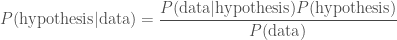
We can do this using Bayes’ theorem

\displaystyle P(\mathrm{hypothesis}|\mathrm{data}) = \frac{P(\mathrm{data}|\mathrm{hypothesis})P(\mathrm{hypothesis})}{P(\mathrm{data})}.

In this context, we give names to each of the probabilities (to make things sound extra fancy): P(\mathrm{hypothesis}|\mathrm{data}) is the posterior, because it’s what we get at the end; P(\mathrm{data}|\mathrm{hypothesis}) is the likelihood, it’s what you may remember calculating in statistics classes; P(\mathrm{hypothesis}) is the prior, because it’s what we believed about our hypothesis before we got the data, and P(\mathrm{data}) is the evidence. If ever you hear of someone doing something in a Bayesian way, it just means they are using the formula above. I think it’s rather silly to point this out, as it’s really the only logical way to do science, but people like to put “Bayesian” in the title of their papers as it sounds cool.

Whenever you get some new information, some new data, you should update your belief in your hypothesis using the above. The prior is what you believed about hypothesis before, and the posterior is what you believe after (you’ll use this posterior as your prior next time you learn something new). There are a couple of examples below, but before we get there I will take a moment to discuss priors.

About priors: what we already know

There have been many philosophical arguments about the use of priors in science. People worry that what you believe affects the results of science. Surely science should be above such things: it should be about truth, and should not be subjective! Sadly, this is not the case. Using Bayes’ theorem is the only logical thing to do. You can’t calculate a probability of what you believe after you get some data unless you know what you believed beforehand. If this makes you unhappy, just remember that when we changed our probability for it being raining outside, it didn’t change whether it was raining or not. If two different people use two different priors they can get two different results, but that’s OK, because they know different things, and so they should expect different things to happen.

To try to convince yourself that priors are necessary, consider the case that you are Sherlock Holmes (one of the modern versions), and you are trying to solve a bank robbery. There is a witness who saw the getaway, and they can remember what they saw with 99% accuracy (this gives the likelihood). If they say the getaway vehicle was a white transit van, do you believe them? What if they say it was a blue unicorn? In both cases the witness is the same, the likelihood is the same, but one is much more believable than the other. My prior that the getaway vehicle is a transit van is much greater than my prior for a blue unicorn: the latter can’t carry nearly as many bags of loot, and so is a silly choice.

If you find that changing your prior (to something else sensible) significantly changes your results, this just means that your data don’t tell you much. Imagine that you checked the weather forecast before leaving the office and it said “cloudy with 0–100% chance of precipitation”. You basically believe the same thing before and after. This really means that you need more (or better) data. I’ll talk about some good ways of calculating priors in the future.

Solving the inverse problem

Example 1: Doughnut allergy

We shall now attempt to use Bayes’ theorem to calculate some posterior probabilities. First, let’s consider a worrying situation. Imagine there is a rare genetic disease that makes you allergic to doughnuts. One in a million people have this disease, that only manifests later in life. You have tested positive. The test is 99% successful at detecting the disease if it is present, and returns a false positive (when you don’t have the disease) 1% of the time. How worried should you be? Let’s work out the probability of having the disease given that you tested positive

\displaystyle P(\mathrm{allergy}|\mathrm{positive}) = \frac{P(\mathrm{positive}|\mathrm{allergy})P(\mathrm{allergy})}{P(\mathrm{positive})}.

Our prior for having the disease is given by how common it is, P(\mathrm{allergy}) = 10^{-6}. The prior probability of not having the disease is P(\mathrm{no\: allergy}) = 1 - P(\mathrm{allergy}). The likelihood of our positive result is P(\mathrm{positive}|\mathrm{allergy}) = 0.99, which seems worrying. The evidence, the total probability of testing positive P(\mathrm{positive}) is found by adding the probability of a true positive and a false positive

 P(\mathrm{positive}) = P(\mathrm{positive}|\mathrm{allergy})P(\mathrm{allergy}) + P(\mathrm{positive}|\mathrm{no\: allergy})P(\mathrm{no\: allergy}).

The probability of a false positive is P(\mathrm{positive}|\mathrm{no\: allergy}) = 0.01. We thus have everything we need. Substituting everything in, gives

\displaystyle P(\mathrm{allergy}|\mathrm{positive}) = \frac{0.99 \times 10^{-6}}{0.99 \times 10^{-6} + 0.01 \times (1 - 10^{-6})} = 9.899 \times 10^{-5}.

Even after testing positive, you still only have about a one in ten thousand chance of having the allergy. While it is more likely that you have the allergy than a random member of the public, it’s still overwhelmingly probable that you’ll be fine continuing to eat doughnuts. Hurray!

Doughnut love

Doughnut love: probably fine.

Example 2: Boys, girls and water balloons

Second, imagine that Iris has three children. You know she has a boy and a girl, but you don’t know if she has two boys or two girls. You pop around for doughnuts one afternoon, and a girl opens the door. She is holding a large water balloon. What’s the probability that Iris has two girls? We want to calculate the posterior

\displaystyle P(\mathrm{two\: girls}|\mathrm{girl\:at\:door}) = \frac{P(\mathrm{girl\:at\:door}|\mathrm{two\: girls})P(\mathrm{two\: girls})}{P(\mathrm{girl\:at\:door})}.

As a prior, we’d expect boys and girls to be equally common, so P(\mathrm{two\: girls}) = P(\mathrm{two\: boys}) = 1/2. If we assume that it is equally likely that any one of the children opened the door, then the likelihood that one of the girls did so when their are two of them is P(\mathrm{girl\:at\:door}|\mathrm{two\: girls}) = 2/3. Similarly, if there were two boys, the probability of a girl answering the door is P(\mathrm{girl\:at\:door}|\mathrm{two\: boys}) = 1/3. The evidence, the total probability of a girl being at the door is

P(\mathrm{girl\:at\:door}) =P(\mathrm{girl\:at\:door}|\mathrm{two\: girls})P(\mathrm{two\: girls}) +P(\mathrm{girl\:at\:door}|\mathrm{two\: boys}) P(\mathrm{two\: boys}).

Using all of these,

\displaystyle P(\mathrm{two\: girls}|\mathrm{girl\:at\:door}) = \frac{(2/3)(1/2)}{(2/3)(1/2) + (1/3)(1/2)} = \frac{2}{3}.

Even though we already knew there was at least one girl, seeing a girl first makes it much more likely that the Iris has two daughters. Whether or not you end up soaked is a different question.

Example 3: Fudge!

Finally, we shall return to the case of Ted and his overconsumption of fudge. Ted claims to have eaten a lethal dose of fudge. Given that he is alive to tell the anecdote, what is the probability that he actually ate the fudge? Here, our data is that Ted is alive, and our hypothesis is that he did eat the fudge. We have

\displaystyle P(\mathrm{fudge}|\mathrm{survive}) = \frac{P(\mathrm{survive}|\mathrm{fudge})P(\mathrm{fudge})}{P(\mathrm{survive})}.

This is a case where our prior, the probability that he would eat a lethal dose of fudge P(\mathrm{fudge}), makes a difference. We know the probability of surviving the fatal dose is P(\mathrm{survive}|\mathrm{fudge}) = 0.5
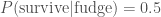
. The evidence, the total probability of surviving P(\mathrm{survive}),  is calculated by considering the two possible sequence of events: either Ted ate the fudge and survived or he didn’t eat the fudge and survived

P(\mathrm{survive}) = P(\mathrm{survive}|\mathrm{fudge})P(\mathrm{fudge}) + P(\mathrm{survive}|\mathrm{no\: fudge})P(\mathrm{no\: fudge}).

We’ll assume if he didn’t eat the fudge he is guaranteed to be alive, P(\mathrm{survive}| \mathrm{no\: fudge}) = 1. Since Ted either ate the fudge or he didn’t P(\mathrm{fudge}) + P(\mathrm{no\: fudge}) = 1. Therefore,

P(\mathrm{survive}) = 0.5 P(\mathrm{fudge}) + [1 - P(\mathrm{fudge})] = 1 - 0.5 P(\mathrm{fudge}).

This gives us a posterior

\displaystyle P(\mathrm{fudge}|\mathrm{survive}) = \frac{0.5 P(\mathrm{fudge})}{1 - 0.5 P(\mathrm{fudge})}.

We just need to decide on a suitable prior.

If we believe Ted could never possibly lie, then he must have eaten that fudge and P(\mathrm{fudge}) = 1. In this case,

\displaystyle P(\mathrm{fudge}|\mathrm{survive}) = \frac{0.5}{1 - 0.5} = 1.

Since we started being absolutely sure, we end up being absolutely sure: nothing could have changed our mind! This is a poor prior: it is too strong, we are being closed-minded. If you are closed-minded you can never learn anything new.

If we don’t know who Ted is, what fudge is, or the ease of consuming a lethal dose, then we might assume an equal prior on eating the fudge and not eating the fudge, P(\mathrm{fudge}) = 0.5. In this case we are in a state of ignorance. Our posterior is
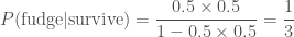
\displaystyle P(\mathrm{fudge}|\mathrm{survive}) = \frac{0.5 \times 0.5}{1 - 0.5 \times 0.5} = \frac{1}{3}.

 Even though we know nothing, we conclude that it’s more probable that the Ted did not eat the fudge. In fact, it’s twice as probable that he didn’t eat the fudge than he did as P(\mathrm{no\: fudge}|\mathrm{survive}) = 1 -P(\mathrm{fudge}|\mathrm{survive}) = 2/3.

In reality, I think that it’s extremely improbable anyone could consume a lethal dose of fudge. I’m fairly certain that your body tries to protect you from such stupidity by expelling the fudge from your system before such a point. However, I will concede that it is not impossible. I want to assign a small probability to P(\mathrm{fudge}). I don’t know if this should be one in a thousand, one in a million or one in a billion, but let’s just say it is some small value p. Then

\displaystyle P(\mathrm{fudge}|\mathrm{survive}) = \frac{0.5 p}{1 - 0.5 p} \approx 0.5 p.

as the denominator is approximately one. Whatever small probability I pick, it is half as probable that Ted ate the fudge.

Mr. Impossible

I would assign a much higher probability to Mr. Impossible being able to eat that much fudge than Ted.

While it might not be too satisfying that we can’t come up with incontrovertible proof that Ted didn’t eat the fudge, we might be able to shut him up by telling him that even someone who knows nothing would think his story is unlikely, and that we will need much stronger evidence before we can overcome our prior.

Homework example: Monty Hall

You now have all the tools necessary to tackle the Monty Hall problem, one of the most famous probability puzzles:

You are on a game show and are given the choice of three doors. Behind one is a car (a Lincoln Continental), but behind the others are goats (which you don’t want). You pick a door. The host, who knows what is behind the doors, opens another door to reveal goat. They then offer you the chance to switch doors. Should you stick with your current door or not? — Monty Hall problem

You should be able to work out the probability of winning the prize by switching and sticking. You can’t guarantee you win, but you can maximise your chances.

Summary

Whenever you encounter new evidence, you should revise how probable you think things are. This is true in science, where we perform experiments to test hypotheses; it is true when trying to solve a mystery using evidence, or trying to avoid getting a goat on a game show. Bayes’ theorem is used to update probabilities. Although Bayes’ theorem itself is quite simple, calculating likelihoods, priors and evidences for use in it can be difficult. I hope to return to all these topics in the future.

On symmetry

Dave Green only combs half of his beard, the rest follows by symmetry. — Dave Green Facts

Physicists love symmetry! Using symmetry can dramatically simplify a problem. The concept of symmetry is at the heart of modern theoretical physics and some of the most beautiful of scientific results.

In this post, I’ll give a brief introduction to how physicists think about symmetry. Symmetry can be employed in a number of ways when tackling a problem; we’ll have a look at how they can help you ask the right question and then check that your answer makes sense. In a future post I hope to talk about Noether’s Theorem, my all-time favourite result in theoretical physics, which is deeply entwined with the concept of symmetry. First, we shall discuss what we mean when we talk about symmetry.

What is symmetry?

We say something is symmetric with respect to a particular operation if it is unchanged after that operation. That might sound rather generic, but that’s because the operation can be practically anything. Let’s consider a few examples:

  • Possibly the most familiar symmetry would be reflection symmetry, when something is identical to its mirror image. Something has reflection symmetry if it is invariant under switching left and right. Squares have reflection symmetry along lines in the middle of their sides and along their diagonals, rectangles only have reflection symmetry along the lines in the middle of their sides, and circles have reflection symmetry through any line that goes through their centre.
    The Star Trek Mirror Universe actually does not have reflection symmetry with our own Universe. First, they switch good and evil, rather than left and right, and second, after this transformation, we can tell the two universes apart by checking Spock’s beard.
  • Rotational symmetry is when an object is identical after being rotated. Squares are the same after a 90° rotation, rectangles are the same after a 180° rotation, and circles are the same after a rotation by any angle. There is a link between the rotational symmetry of these shapes and their mirror symmetry: you can combine two reflections to make a rotation. With rotations we have seen that symmetries can either be discrete, as for a square when we have to rotate by multiples of 90°, or continuous, as for the circle where we can pick any angle we like.
  • Translational symmetry is similar to rotational symmetry, but is when an object is the same when shifted along a particular direction. This could be a spatial direction, so shifting everything to the left, or in time. This are a little more difficult to apply to the real world than the simplified models that physicists like to imagine.
    For translational invariance, imagine an infinite, flat plane, the same in all directions. This would be translational invariant in any direction parallel to the ground. It would be a terrible place to lose your keys. If you can imagine an infinite blob of tangerine jelly, that is entirely the same in all directions, we can translate in any direction we like. We think the Universe is pretty much like this on the largest scales (where details like galaxies are no longer important), except, it’s not quite as delicious.
    The backgrounds in some Scooby-Doo cartoons show periodic translational invariance: they repeat on a loop, so if you translate by the right amount they are the same. This is a discrete symmetry, just like rotating my a fixed angle. Similarly, if you have a rigid daily routine, such that you do the same thing at the same time every day, then your schedule is symmetric with respect to a time translation of 24 hours.
  • Exchange symmetry is when you can swap two (or more) things. If you are building a LEGO model, you can switch two bricks of the same size and colour and end up with the same result, hence it is symmetric under the exchange of those bricks. The idea that we have the same physical system when we swap two particles, like two electrons, is important in quantum mechanics. In my description of translational symmetry, I could have equally well have used lime jelly instead of tangerine, or even strawberry, hence the argument is symmetric under exchange of flavours. The symmetry is destroyed should we eat the infinite jelly Universe (we might also get stomach ache).
    Mario and Luigi are not symmetric under exchange, as anyone who has tried to play multiplayer Super Mario Bros. will know, as Luigi is the better jumper and has the better moustache.

There are lots more potential symmetries. Some used by physicists seem quite obscure, such as Lorentz symmetry, but the important thing to remember is that a symmetry of a system means we get the same thing back after a transformation.

Sometimes we consider approximate symmetries, when something is almost the same under a transformation. Coke and Pepsi are approximately exchange symmetric: try switching them for yourself. They are similar, but it is possible to tell them apart. The Earth has approximate rotational symmetry, but it is not exact as it is lumpy. The spaceship at the start of Spaceballs has approximate translational invariance: it just keeps going and going, but the symmetry is not exact as it does end eventually, so the symmetry only applies to the middle.

How to use symmetry

When studying for an undergraduate degree in physics, one of the first things you come to appreciate is that some coordinate systems make problems much easier than others. Coordinates are the set of numbers that describe a position in some space. The most familiar are Cartesian coordinates, when you use x and y to describe horizontal and vertical position respectively. Cartesian coordinates give you a nice grid with everything at right-angles. Undergrad students often like to stick with Cartesian coordinates as they are straight-forward and familiar. However, they can be a pain when describing a circle. If we want to plot a line five units from the origin of of coordinate system (0,\,0), we have to solve \sqrt{x^2 + y^2} = 5. However, if we used a polar coordinate system, it would simply be r = 5. By using coordinates that match the symmetry of our system we greatly simplify the problem!

Treasure map

Pirates are trying to figure out where they buried their treasure. They know it’s 5 yarrrds from the doughnut. Calculating positions using Cartesian coordinates is difficult, but they are good for specifying specific locations, like of the palm tree.

Treasure map

Using polar coordinates, it is easy to specify the location of points 5 yarrrds from the doughnut. Pirates prefer using the polar coordinates, they really like using r.

Picking a coordinate system for a problem should depend on the symmetries of the system. If we had a system that was translation invariant, Cartesian coordinates are the best to use. If the system was invariant with respect to translation in the horizontal direction, then we know that our answer should not depend on x. If we have a system that is rotation invariant, polar coordinates are the best, as we should get an answer that doesn’t depend on the rotation angle \varphi. By understanding symmetries, we can formulate our analysis of the problem such that we ask the best questions.

At the end of my undergrad degree, my friends and I went along to an awards ceremony. I think we were hoping they’d have the miniature éclairs they normally had for special occasions. There was a chap from an evil corporation™ giving away branded clocks, that apparently ran on water. We were fairly convinced there was more to it than that, so, as now fully qualified physicists, we though we should able to figure it out. We quickly came up with two ideas: that there was some powder inside the water tank that reacted with the water to produce energy, or that the electrodes reacted in a similar way to in a potato clock. We then started to argue about how to figure this out. At this point, Peter Littlewood, then head of the Cavendish Laboratory, wandered over. We explained the problem, but not our ideas. Immediately, he said that it must be to do with the electrodes due to symmetry. Current flows to power the clock. It’ll either flow left to right through the tank, or right to left. It doesn’t matter which, but the important thing is the clock can’t have reflection symmetry. If it did, there would be no preferred direction for the current to flow. To break the symmetry, the two (similar looking) electrodes must actually be different (and hence the potato clock theory is along the right lines). My friends and I all felt appropriately impressed and humbled, but it served as a good reminder that a simple concept like symmetry can be a powerful tool.

A concept I now try to impress upon my students, is to use symmetry to guide their answers. Most are happy enough to use symmetry for error checking: if the solution is meant to have rotational symmetry and their answer depends on \varphi they know they’ve made a mistake. However, symmetry can sometimes directly tell you the answer.

Lets imagine that you’ve baked a perfectly doughnut, such that it has rotational symmetry. For some reason you sprinkled it with an even coating of electrons instead of hundreds and thousands. We now want to calculate the electric field surrounding the doughnut (for obvious reasons). The electric field tells us which way charges are pushed/pulled. We’d expect positive charges to be attracted towards our negatively charged doughnut. There should be a radial electric field to pull positive charges in, but since it has rotational symmetry, there shouldn’t be any field in the \varphi direction, as there’s now reason for charges to be pulled clockwise or anticlockwise round our doughnut. Therefore, we should be able to write down immediately that the electric field in the \varphi direction is zero, by symmetry.

Most undergrads, though, will feel that this is cheating, and will often attempt to do all the algebra (hopefully using polar coordinates). Some will get this wrong, although there might be a few who are smart enough to note that their answer must be incorrect because of the symmetry. If symmetry tells you the answer, use it! Although it is good to practise your algebra (you get better by training), you can’t learn anything more than you already knew by symmetry. Working efficiently isn’t cheating, it’s smart.

Symmetry is a useful tool for problem solving, and something that everyone should make use of.