Ofsted have recently published statistics relating to the subject choices of students starting A levels in England in 2013/2014. (For those unfamiliar with A levels, they are the qualifications taken between the ages of 16 and 18, students usually pick 3–4 subjects for the first year, which is known as AS, and normally slim down to 3 for the second year, A2; university admissions are based upon A level results). This is part of an effort to understand what drives students to pick different subjects and particularly science. Engaging students in science is a challenge, although many enjoy it or can achieve well in tests, then can struggle to see that it is for them. In Physics, we have a particular problem recruiting girls, which means we are not getting the best mix of people. I was interesting in having a look at the subject choices, so I’ve put together a few graphs.
Subject popularity
The most popular subjects at AS level are:
- English,
- Mathematics,
- Psychology.
English and Maths make sense, as they’ll be familiar from previous study and are of general applicability. I was surprised that Psychology came third, since it’ll be a new subject; the top ten consists of subjects familiar from pre-16 education, with the exception of the two social sciences, Psychology and Sociology (8). Physics comes in at number 7, behind both Biology (4) and Chemistry (6). This makes me sad, but at least Physics is still one of the most popular choices.
The distribution of student numbers is show in the graph below. I’ve not quite figured out what the distribution of student numbers should be, but it’s roughly exponential. There are too many subjects to label individually, so I’ve grouped them roughly by subject area. The main sciences (Biology, Chemistry and Physics) all do rather well, but modern languages are languishing towards the bottom of the list (top is French at 21). The smallest subjects have been grouped together into Other categories, these make up the bottom of the distribution, but in amongst them are Classical studies (29), German (30), and Accounting & finance (31).
Student numbers in the most popular subjects at AS level (in England 2013/2014). Data from A level subject take-up.
Gender differences
The report also lists the numbers of boys and girls taking each subject. I know that Physics is male-dominated, but I didn’t know how this compared to other subjects. To quantify the imbalance, I’m going to define the asymmetry as
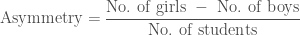
This is 0 if there are equal numbers of boys and girls, and is ±1 if completely made up of boys (−1) or girls (+1). Overall, more girls than boys are taking A levels, giving an total asymmetry of 0.0977. That’s not great, but we’ll see it’s smaller than is typically the case for individual subjects.
The most male-dominated subjects are:
- Computing (−0.8275),
- Physics (−0.5446),
- Further mathematics (−0.4569).
The most female-dominated subjects are:
- Sociology (0.5084),
- Art & design (0.4896),
- French (0.4531).
We see that Physics is in pretty poor shape, being the second most asymmetric subject overall. However, Computing is really out in a league of it’s own: there are almost 11 boys for every girl in the subject! That is not healthy. The most balanced subjects are:
- Geography (0.0056),
- Chemistry (−0.0167),
- Government & politics (−0.0761).
These are the only subjects with asymmetries smaller than the overall population of students. The gender balance in Chemistry shows that the Physical sciences don’t need to be male-dominated; however, this could equally reflect the compromise between male-dominated Physics and female-dominated Biology (0.2049).
The graph below plots the number of students taking a subject and its asymmetry. There’s no real trend with student numbers, it’s not the case that it’s easier for smaller subjects to become biased or that it’s easier for larger subjects to develop a reputation.

Scatter plot of the number of students and gender asymmetry of AS subjects (in England 2013/2014). Higher points are more female dominated and lower points are more male dominated. The dashed line indicates gender parity and the dotted line indicates the average for all subjects. Data from A level subject take-up.
Normally, I’d expect there to be scatter in a quantity like asymmetry: some values high, some low, but more clustering in the middle than out in the extremes. Looking at the plot above, this doesn’t seem to be the case. There are relatively few subjects in the middle, but there seem to be two clusters, one at small positive asymmetries and another at small negative asymmetries. I’ve plotted the distribution of subject asymmetries below. To make it clearer to view (and to make a nice smooth, continuous distribution), I’ve smeared out the individual subjects. These means I’m actually plotting the density of subjects per unit of asymmetry, rather than the number of subjects: if you work out the area under the curve, that gives the number of subjects in that range. (For those who care, I’ve convolved with a Gaussian kernel with a standard deviation of 0.1, and made sure to renormalise them so that the total area is correct).

Smoothed distribution of gender asymmetry for AS subjects (in England 2013/2014). Left is male dominated and right is female dominated. The area under the curve gives the number of subjects. The diamonds mark the locations of individual subjects. Data from A level subject take-up.
It does appear that there are two peaks: one for boys’ subjects and another for girls’. Computing is off being a clear outlier. However, if I turn up the smoothing (using a standard deviation of 0.3), this disappears. This always happens if you smooth too much…

Heavily smoothed distribution of gender asymmetry for AS subjects (in England 2013/2014). Left is male dominated and right is female dominated. The area under the curve gives the number of subjects. The diamonds mark the locations of individual subjects. Data from A level subject take-up.
It looks like this is one of the cases where I should really do things properly and I should come back to look at this again later.
Regardless of whether my suspicion of there being two clusters of subjects is correct, there does appear to be a spectrum of subjects, with some being as perceived as for boys and others for girls. This differentiation exists already exists at age 16—even for subjects like Psychology and Sociology that have not been studied previously. It seems that these stereotypes are ingrained from an earlier age.

Ada, Countess of Lovelace, mathematician and first computer programmer (and superheroine), and Sigmund Freud, neurologist and founder of psychoanalysis. Evidence that there really shouldn’t be divides in Computing, Psychology or any other subject.
Continuation
As well as looking at how many students take AS, we can look at how many continue to A2. The report gives the percentage that continue for both boys and girls. The distribution of all continuation percentages is shown below, again with subjects grouped by area. The average progression across all subjects is 72.7%.

Percentage continuation from AS to A2 for different subjects (in England 2013/2014). The dotted line indicates the average. Data from A level subject take-up.
The top subjects for continuation to A2 are:
- Other modern languages (90.4%),
- Drama (82.7%),
- Media/film/TV studies (81.4%).
Other modern languages is the smallest subject in terms of student numbers, but has the highest continuation: I guess those who opt for it are dedicated to seeing it through. However, there doesn’t seem to be a correlation between student numbers and continuation. English, the most popular subject, comes in just below Media/film/TV studies with 81.2%. The bottom subjects for continuation are:
- Other social sciences (45.9%),
- Accounting & finance (59.7%),
- Computing (61.4%).
I don’t know enough about these subjects to know if there might be a particular reason why just taking them for one year might be useful. In contrast to Other modern languages, German (62.7%), French (64.1%) and Spanish (65.8%) have some of the lowest continuation rates (coming in just above Computing). Physics also does poorly, with only 67.8% continuing, below both Chemistry (71.0%) and Biology (72.2%). For comparison, Further mathematics has 68.3% continuation and Mathematics has 75.4%. I would expect continuation to be lower for subjects that students find more difficult (possibly with the biggest jump from GCSE).
Now, let’s have a look at the difference in progression between the genders. In the figure below, I plot the difference in the percentage progression between boys and girls,

versus the asymmetry. The two quantities show a clear correlation: more girls than boys progress in subjects that are female dominated and vice versa. Gender asymmetry gets worse with progression.

Scatter plot of the gender asymmetry and difference in percentage progression of AS subjects (in England 2013/2014). Left is male dominated and right is female dominated. Higher points have a higher proportion of girls than boys continuing and lower points have a higher proportion of boys than girls continuing. Data from A level subject take-up.
The subjects with the largest differences in continuation are:
- Physics (−14%),
- Other science (−12%),
- Psychology (11%).
That’s a really poor show for Physics. This polarising trend is not surprising. People like to be where they feel they belong. If you’re conspicuously outnumbered, you’re more likely to feel uncomfortable. Data show that girls are more likely to continue with Physics in all-girls schools. Also, as we’ve seen, there seems to be a clustering of boys’ subjects and girls’ subjects, and developing these reputations can make it difficult for people to go against stereotypes. This impacts both how people view themselves and others, potentially impacting perceived competence (e.g., for Physics, Gonslaves 2014a, 2014b). These cultural biases are something we need to work against if we’re going the get the best mix of students (I guess it’s good we have all these Psychologists and Sociologists to help figure this out).
I’d recommend trying the excellent (and adorable) Parable of the Polygons to see how biases can become magnified.
Summary
At A level, some subjects are favoured by boys or by girls. This imbalance gets larger during the transition from AS to A2. Physics is one of the most popular subjects at AS level, but lags behind the other main sciences. It has a poor gender ratio, which notably gets worse going from AS to A2. Physics is (arguably) the the most awesome subject, so we should do more to show that is for everyone. If you’d like to play around the data (and don’t fancy typing it out yourself), I have it available via Google Drive.
(For disclosure: I took Geography at AS, and Physics, Maths and Further maths at A2).
 ,
,  , etc., or as
  where the subscript
  is used as shorthand to indicate any of the possible outcomes. The probability of the numeric value being a particular
  . For rolling our dice, the outcomes are one to six (
 ,
,  , etc.) and the probabilities are
 .
. ,
, means
means  .
. ,
, is the probability density function.
 and find out how high it needs to be to be worthwhile. We can use the expectation value to calculate how much we should expect to pay, if this is less than the bill as it stands, it’s worth giving it a go, if the expectation value is larger than the original bill, we should expect to pay more (and so probably shouldn’t play). The expectation value is
 ,
, is less than one, so if
  , it’s worth playing. If we were tossing a (fair) coin, we’d expect to come out even, if we had to roll a six, we’d expect to pay more.
 . Imagine each outcome
  times, then the mean is
 .
. so that
  .
. . This can be done by adding up probabilities until you get a half
 .
. ,
, is the lower limit of the distribution. (That’s all the calculus out of the way now, so if you’re not a fan you can relax). The
  .
. .
.